Cricket explore +
Cricket Explore + is the first and only of it’s kind in the pre-paid space. Cricket’s proprietary in-store application allows customers to view device pricing and specifications, rate plan features, coverage and more. Over a year was spent concepting, wire framing, redesigning and working with the developer to launch an all new 2.0 which looks to better serve the customer and their needs, as well as gather data and drive sales.
The Old Experience


Launched in 2020, Cricket Explore was intended to be a digital price tag solution to eliminate the need to print at the store level and allowed for fewer pricing errors. No more old price tags being left out and causing customer confusion. However, it came with it’s own set of barriers and limitations. No scrolling, lots of drop downs that were hard to navigate inside a security stem, and design limitations made any sort of hierarchy hard to achieve.

Research & Concepting
Incorporating customer feedback, representative feedback, consumer research data and even pain points we had on our side, we ideated around best practices inside and outside of the market segment. Combining all of those findings into wire frames that we workshopped with the clients and the developer.
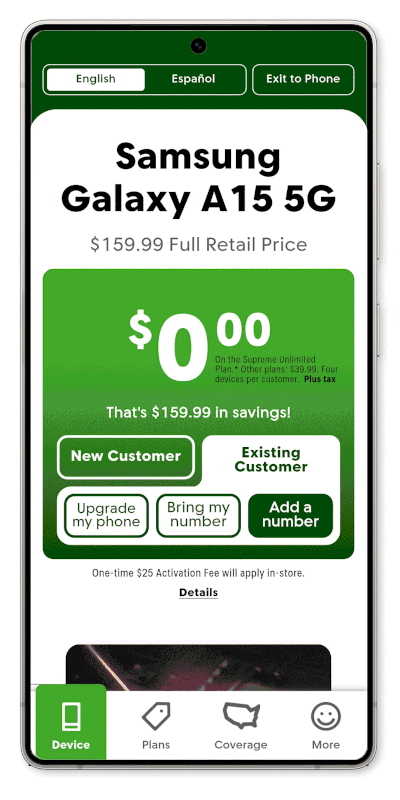
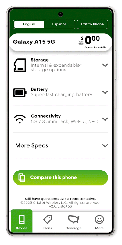
Device page
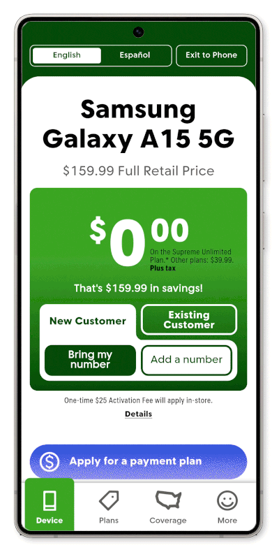
The most important piece of information for a Cricket shopper is the price. However, in the old layout, they were seeing all of them, including a potentially better price than they qualified to receive. In order to combat this, we developed a widget that includes a decision tree that guides the customer to their best price. It then follows the them throughout the experience, even when the widget is off screen or they are on other pages, always being top of mind.
To make the device itself more attractive, we brought in a carousel of features that utilized images and videos. The more detailed specifications each have a drop down that contains additional information, legal, or a call to action to compare the device. Each click gives specific data on what our shopper is most interested in seeing.
comparison tool
New to the redesign is the ability to compare devices. Previously, the customer would have to physically walk from device to device to compare, but now they can instantly compare the device they’re looking at to any other device in the fleet.
This gives us data on which phones are the most compared and allows us to adjust the creative throughout the rest of the store and sell more phones.
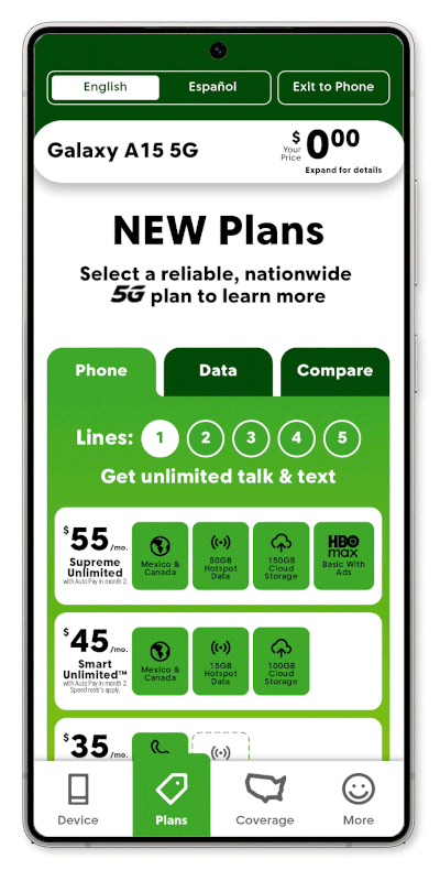
rate plans page
There’s no debate that wireless plans are complicated. One of the tasks we set out to accomplish is the ability for the customer to see the differences at a glance. Price, data and features, what do they need, what do they want.
We developed a widget that shows a high level comparison, with the ability to tap in and see more. Just like the rest of the app, the customer can pick and choose what they’re most interested in, learn more, and see how it compares.
Every tap gives more information on what customers are interested in, and gives concrete data into the Cricket shopper that helps refine the experience.
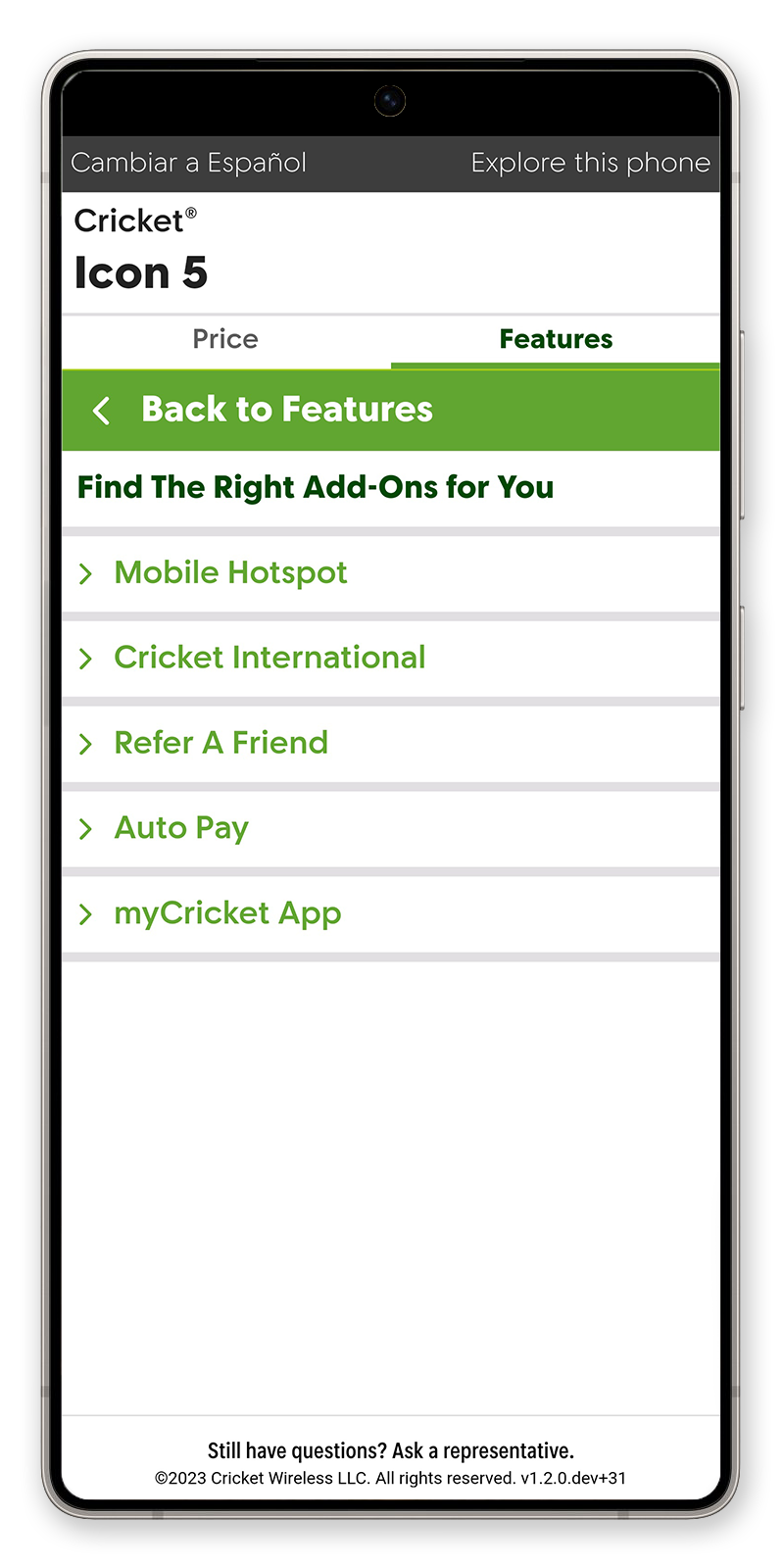
more page
Jokingly named "The Junk Drawer,” this page is home to everything else. Add-ons and additional items that a customer may be interested in. The challenge is how do you display a wide variety of products in a way that is easy to digest and understood without seeming overly complicated.
The bento box design allowed the products to be categorized or live on their own, and gives the ability to push and pull the layout depending, again, on what the data shows the shopper is most interested in.
Images also help break up all of the copy and bring each product to life, while individual pages can help clarify a product or feature and give the rep a chance to up-sell.